3rd Age Crew / now Navigage · Design system + product UI
Care for the people
who cared for you.
A care-coordination and elder-services platform for the sandwich generation - one account for a family's documents, finances, providers, and services. Designed as 3rd Age Crew; the product has since pivoted to Medicare and rebranded as Navigage.
Scope: design system setup + product UI across the platformBrand: logo and colors supplied by the clientPlatform: web + mobile web
01 / Context
A big platform that had to feel small.
3rd Age Crew was built for the “sandwich generation” - adults raising their kids while managing their aging parents' care. One account lets a family organize a parent's documents, finances, medical providers, and services in a single portal. The team came with a logo and colors; my job was the design system and the product design on top of them.
The constraint that shaped everything: this was a genuinely complex product - ten app sections, a multi-vendor services marketplace with real checkout, a family-permissions model, and a support system - and the audience made it harder. Some users are elderly themselves; all of them are stressed. So the design goal was deliberate simplicity: hide the complexity behind one clear action per screen.
30+
Screens
10
App sections
5
Payment options
1
Family account
Then it pivoted.
The product later pivoted from broad elder-care coordination to a Medicare-focused companion and rebranded as Navigage (3rdagecrew.com now redirects to navigage.ai). The case study covers the 3rd Age Crew era - the system and the platform as designed.
02 / The identity
Given a sunrise, I built the sky.
The logo and colors arrived with the client: a circular badge - a sunrise over water, lettered “3rd Age Crew” - and a two-tone wordmark, “3rd Age” in royal blue, “Crew” in orange. My work started where the brand stopped: turning two colors and a badge into a system that could carry ten app sections and a marketplace without ever raising its voice.
The two-tone wordmark is the brand rule in miniature: blue carries the trust, orange carries the warmth - and inside the product, orange carries the action.
03 / The design system
Rebuilt from the evidence.
The design system documentation is lost - what survives is the screens. So the system here is reconstructed from 30+ exported screens: the type scale, the palette, and the component patterns that repeat across every flow. Where a value is reconstructed rather than documented, it says so. The reconstruction is the point: a system real enough to be reverse-engineered is a system that held.
Core tokens / Typography
Reconstructed from the screens. The product runs Proxima Nova; this table renders in Montserrat, its closest open twin - same geometric skeleton, same friendly legibility at UI sizes.
Core tokens / Color
brand / blue
#0048A8
Trust: nav, links, marketing CTAs, informative chrome
action / orange
#FF7800
The moment: accent words and every forward action in the product
ink
#202125
Headings and body
canvas
#F5F7FB
The cool app background behind white cards
member / tint
#FFF1E5 + orange border
Care-recipient and member surfaces
nav / active
#E5F0FF
The light-blue active pill in the sidebar
status / green
#2DB224
Success states only (order confirmation)
The rule the screens follow: blue carries the brand, orange carries the moment. On marketing, the CTA is blue and orange lives inside the headline; inside the product, every forward action - Next, Login, Add to Cart, Place Order, Save Changes - is orange, and green appears only when money or care has landed safely.
Signature device
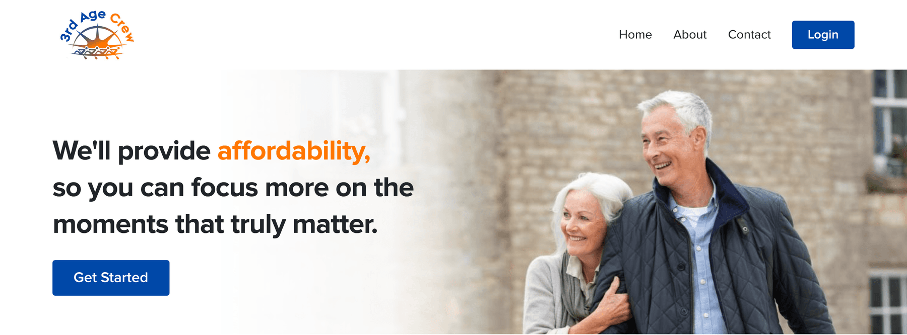
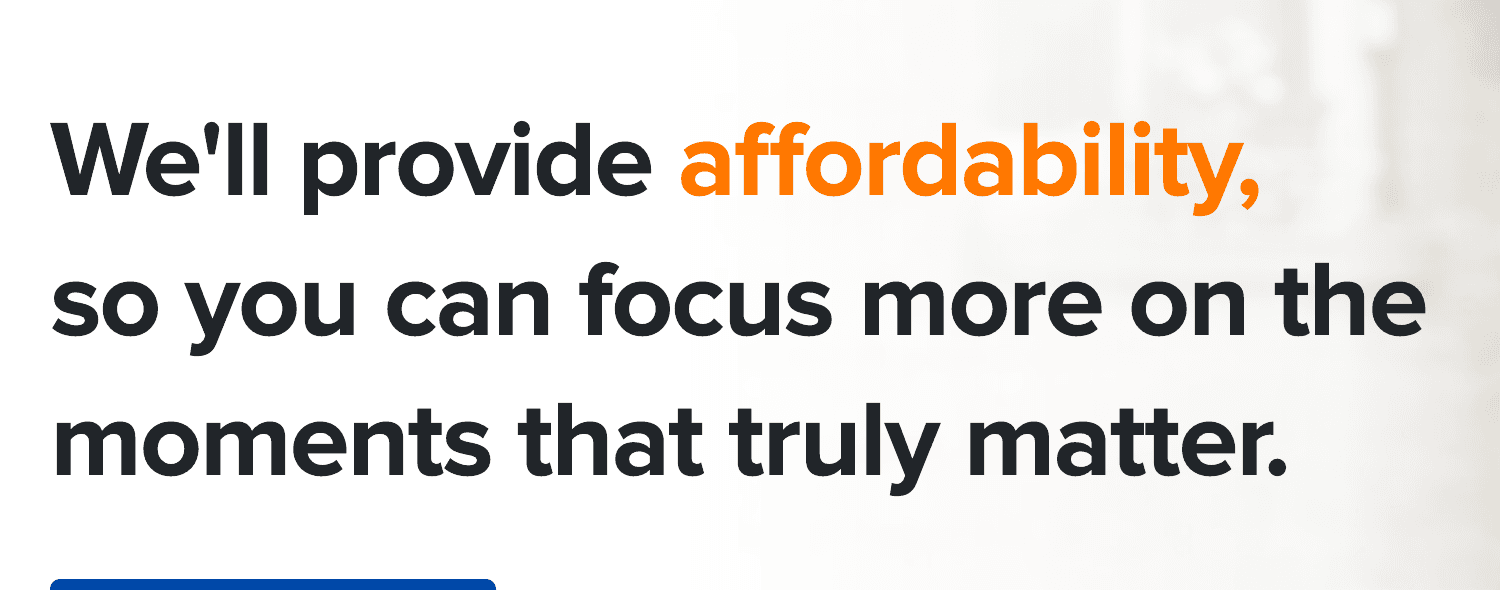
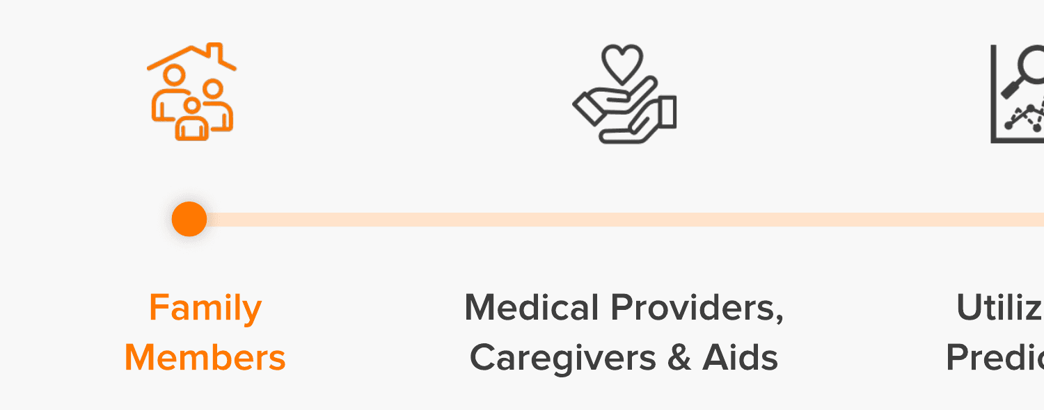
One device runs through the brand: a single word in orange inside key headlines. It marks the word the sentence is about - affordability, care, family - and turns the palette into a reading cue.
Component anatomy
The primitives every screen is built from - rebuilt here natively from the tokens above.
Sidebar nav item
Ten sections, one glance - wayfinding without reading
Care Recipient - 1
Dad
Insurance: Medicaid
Member card
The care recipient is always one glance away
Primary button
One forward action per screen
Badges
Member value visible at a glance
26% Completed
Progress bar
Long tasks made finite
Form field
Easy to hit, easy to read
Component-level specs lived in the lost system docs; these are native rebuilds from the screens.
Spacing and grid - reconstructed from screens
A generous rhythm - 12px card radii, 8px field radii, white cards floating on the cool canvas. Desktop runs a fixed sidebar + fluid content column; mobile collapses to one column with a hamburger. Reconstructed from the exported screens - the original spacing docs are lost.
04 / Simple by design
Simple was the requirement, not the style.
The audience - elderly users and their adult children, often in a stressful moment - turned simplicity into an accessibility requirement, and the screens carry it deliberately.
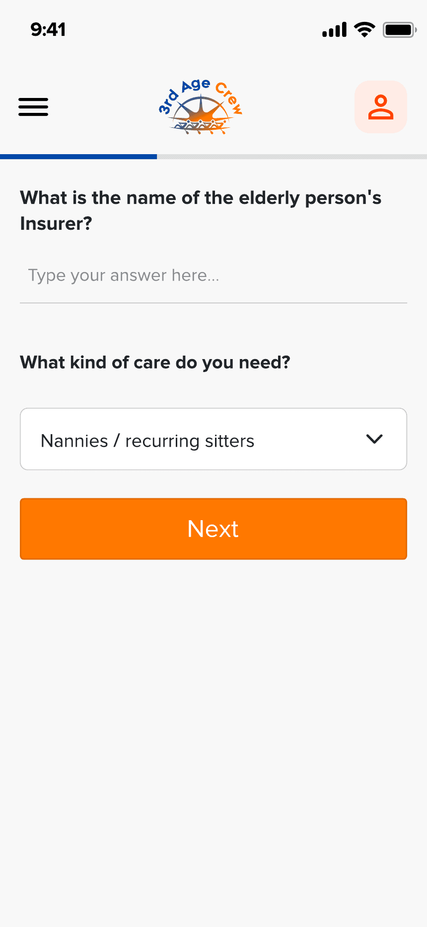
- 1One question per screen - no forms fatigue, no scrolling decisions.
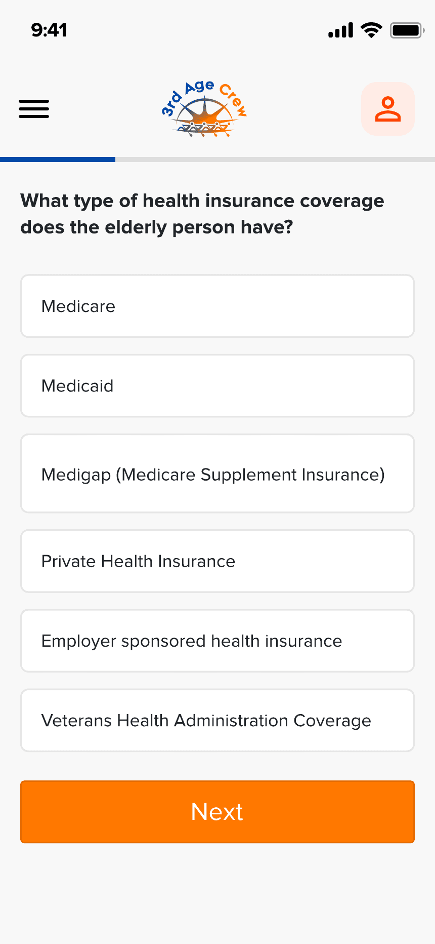
- 2Plain language, never jargon: “What type of health insurance coverage does the elderly person have?” instead of “Select policy type”.
- 3Full-width answer cards with large tap targets, a progress bar always in view.
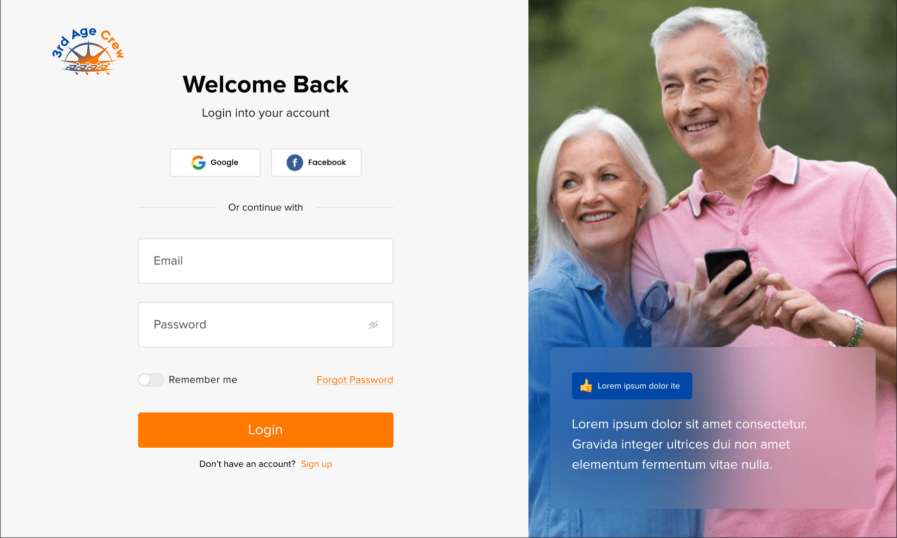
- 1Social login (Google, Facebook) and Remember me - fewer passwords for everyone; signup adds Apple ID.
- 2Split layout with real photography of elderly couples, not stock medical imagery.
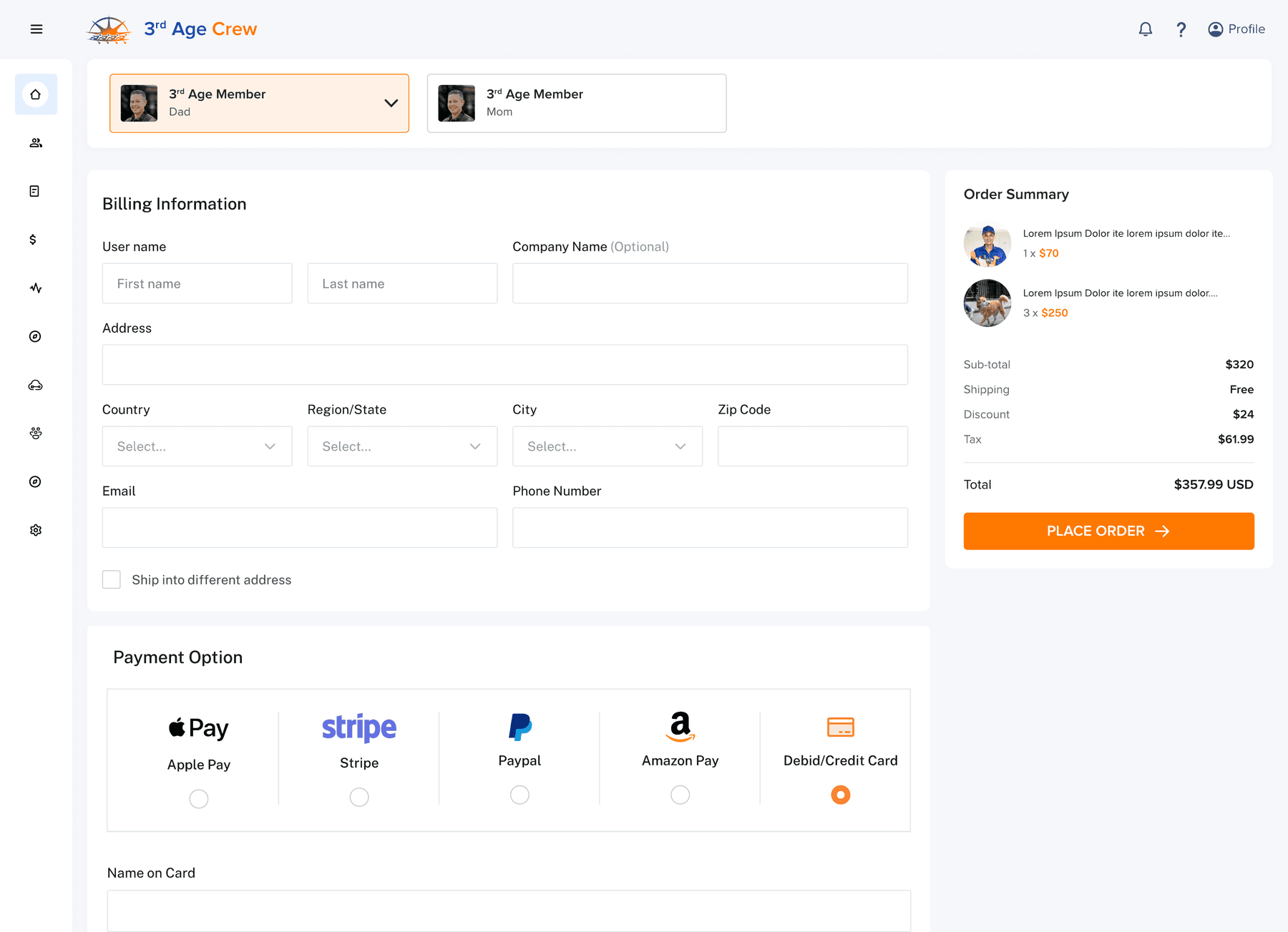
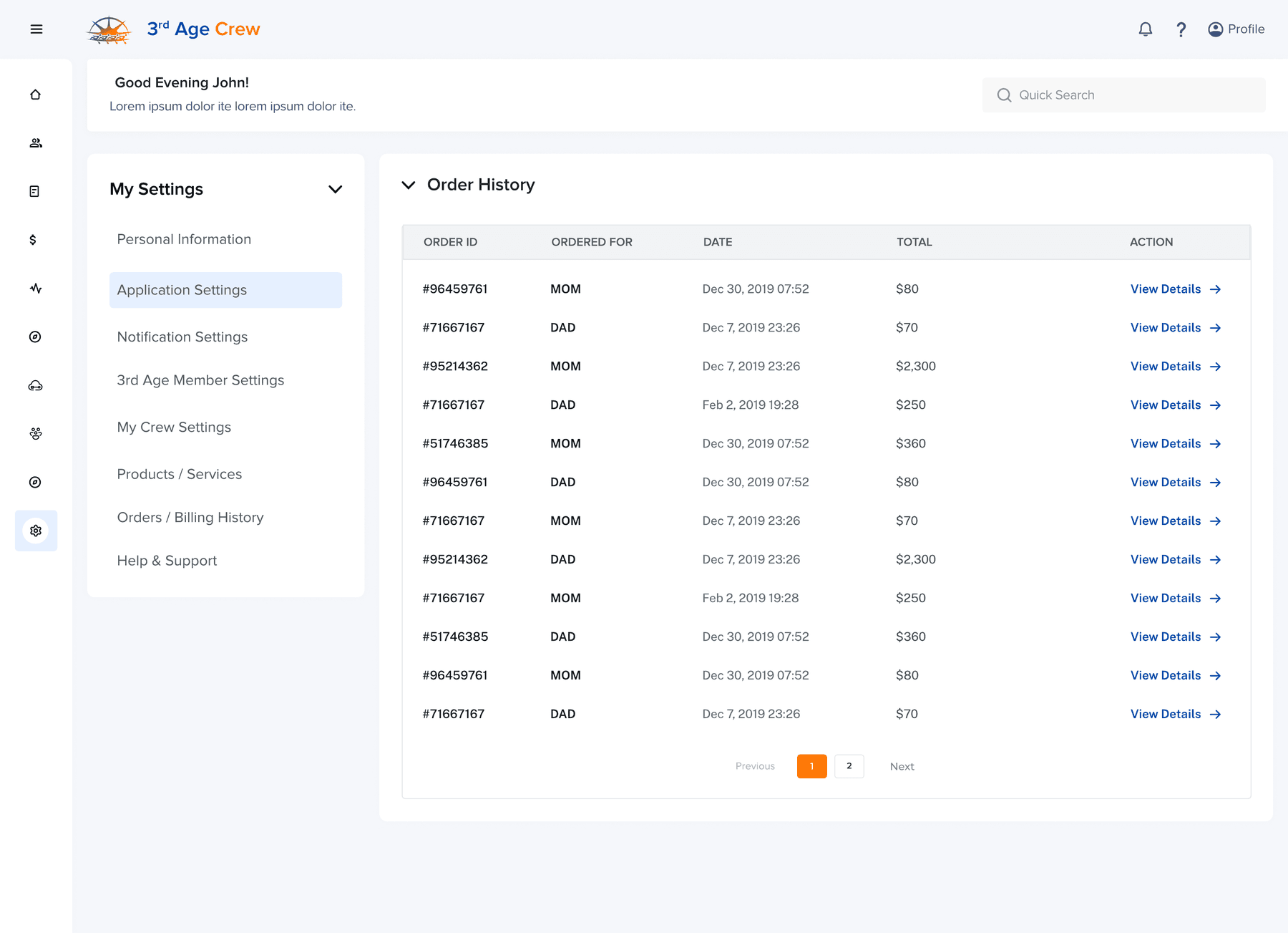
- 1Commerce is member-first: checkout opens with a “3rd Age Member” selector - Dad, Mom - so every purchase is assigned to the parent it serves.
- 2Order history carries an “Ordered For” column; the family account stays legible.
05 / The flows
From first visit to ordered service.
Flow A
Marketing and onboarding
The whole platform, taught before signup.
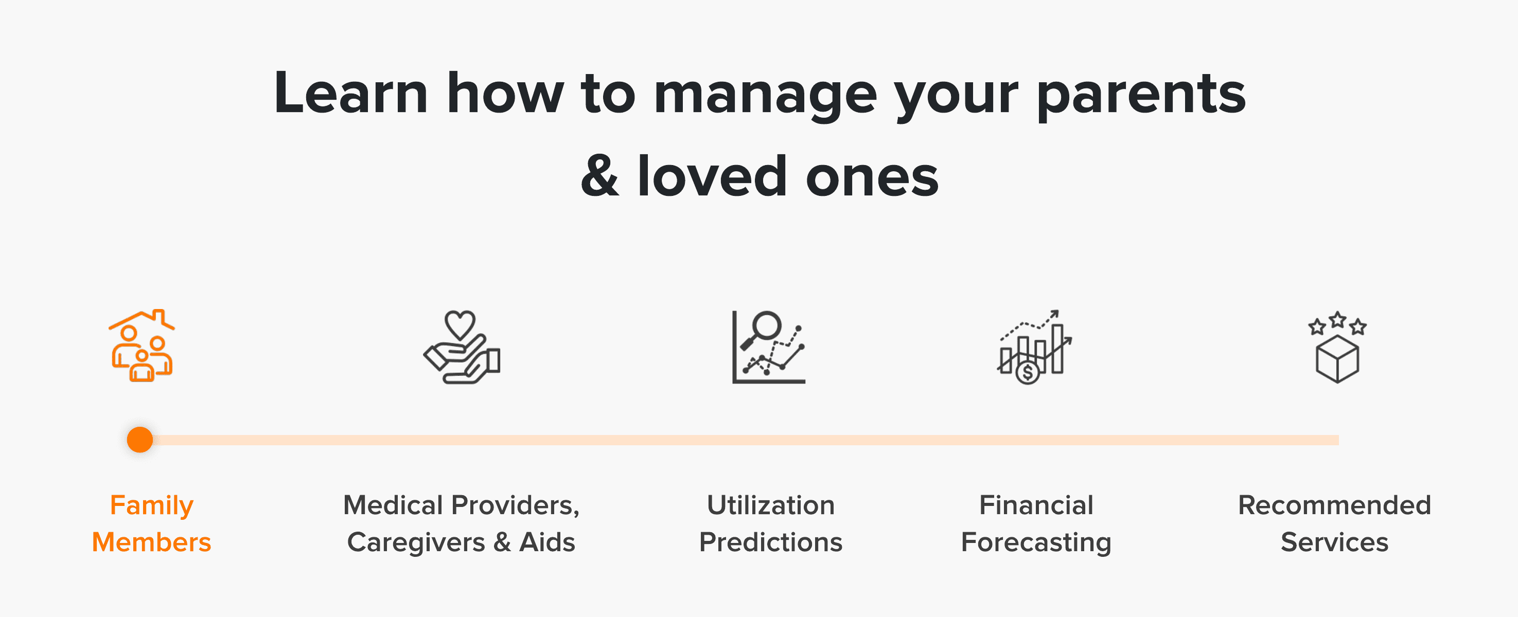
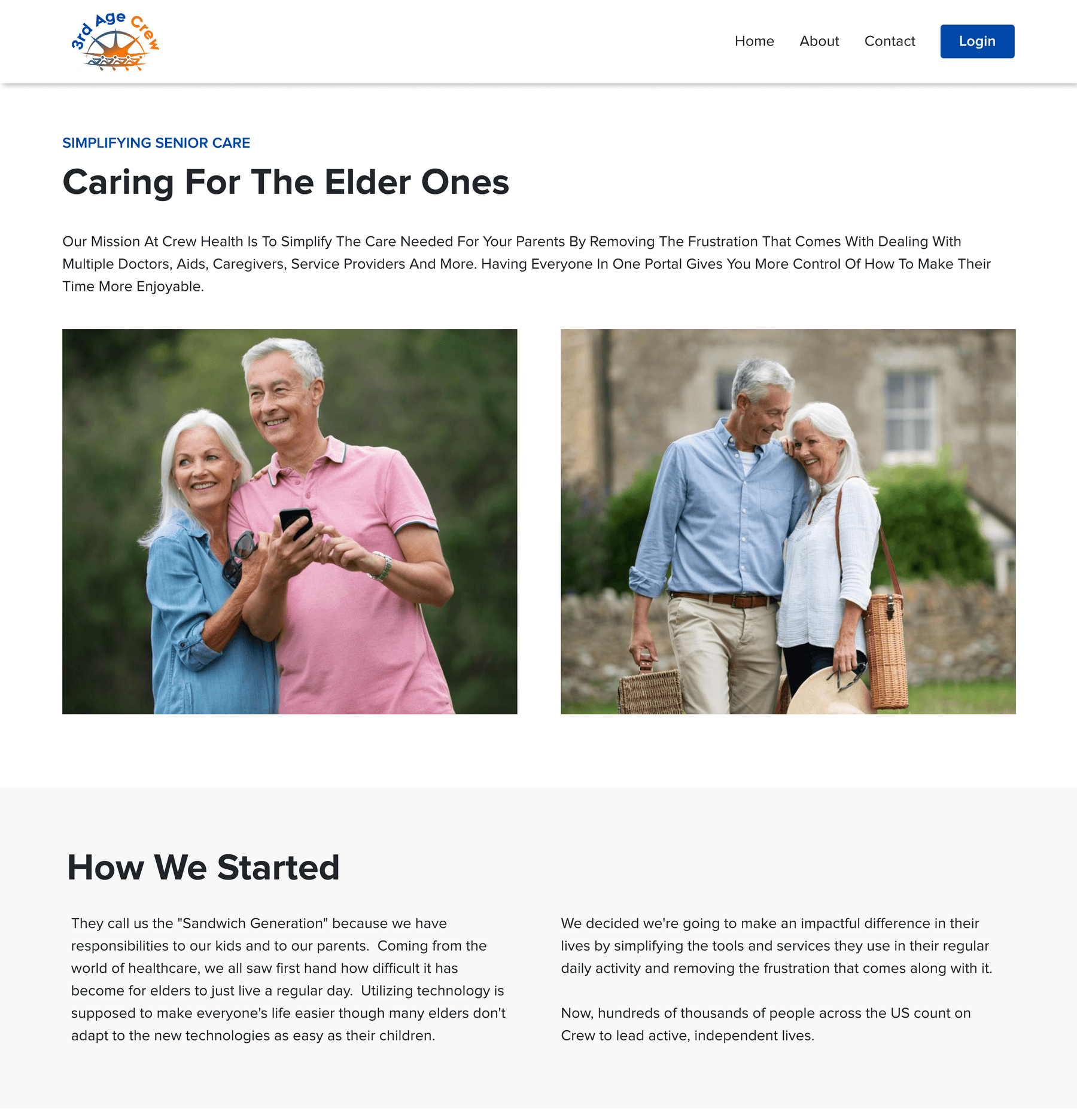
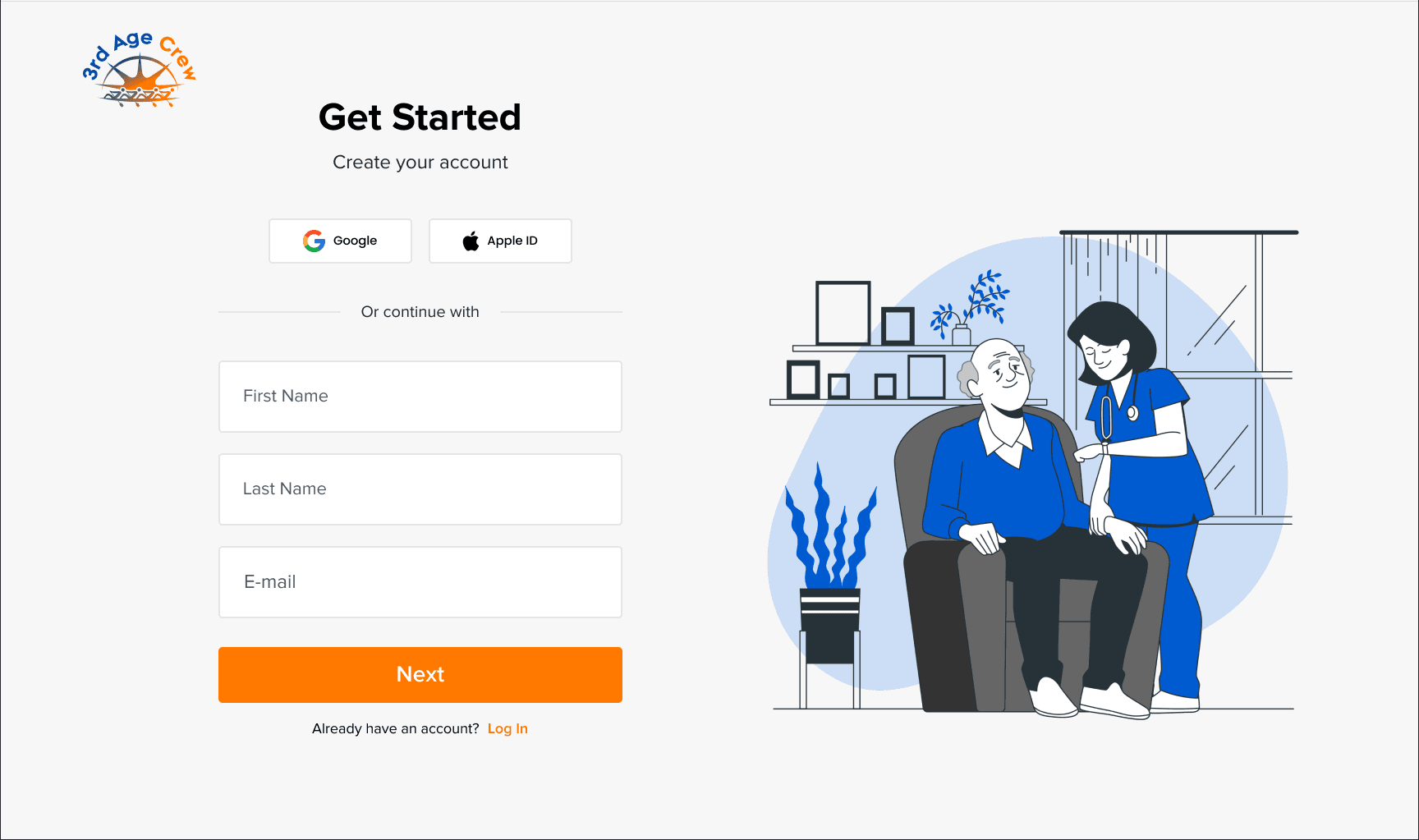
Signup keeps the same split: the form on one side, a caregiver illustration on the other, and social sign-in above the fields.
- 1The five-pillar walk teaches the whole platform before signup.
- 2About leads with the founder story - “They call us the Sandwich Generation” - instead of a pitch.
Flow B
The platform core
Ten sections, one job per card.
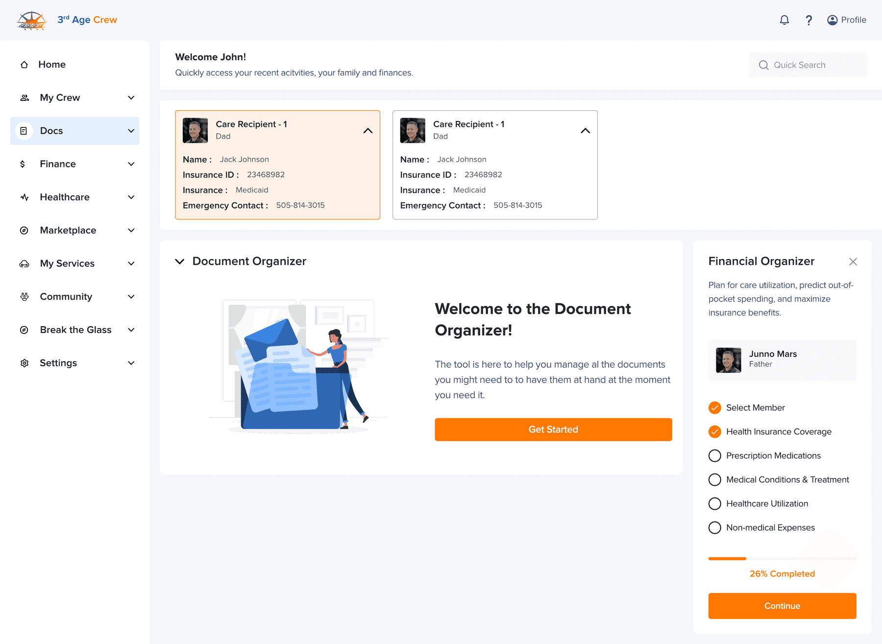
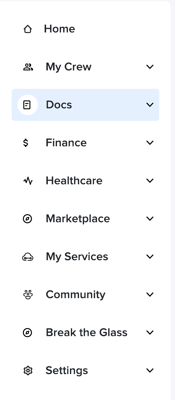
1Ten sections in a single expanding rail: Home, My Crew, Docs, Finance, Healthcare, Marketplace, My Services, Community, Break the Glass, Settings.
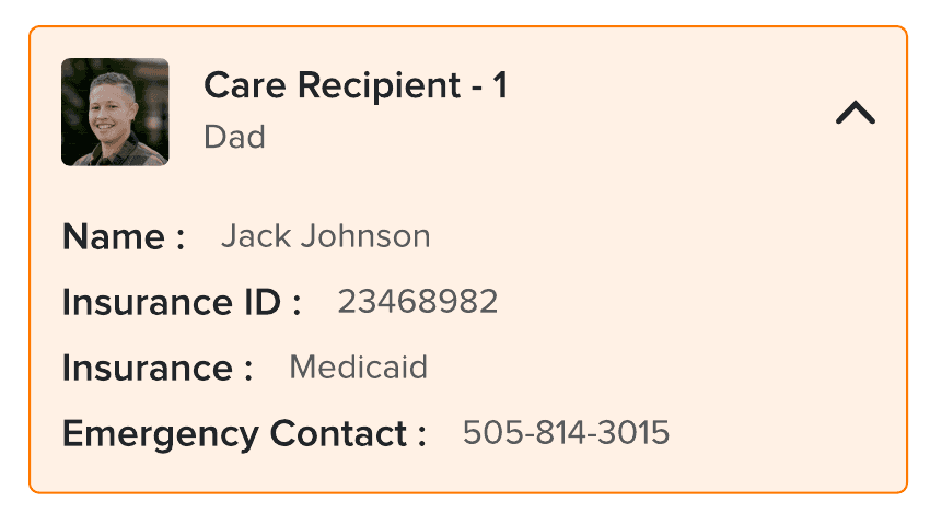
2Member cards carry the orange border and warm tint - the person stays visible inside the paperwork.
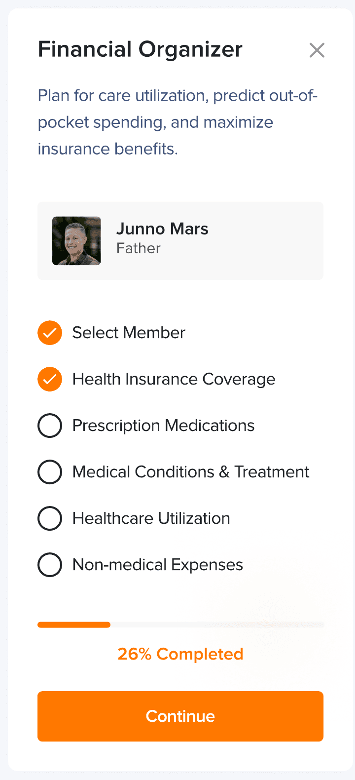
3Wizard checklists show percentage progress so long tasks feel finite.
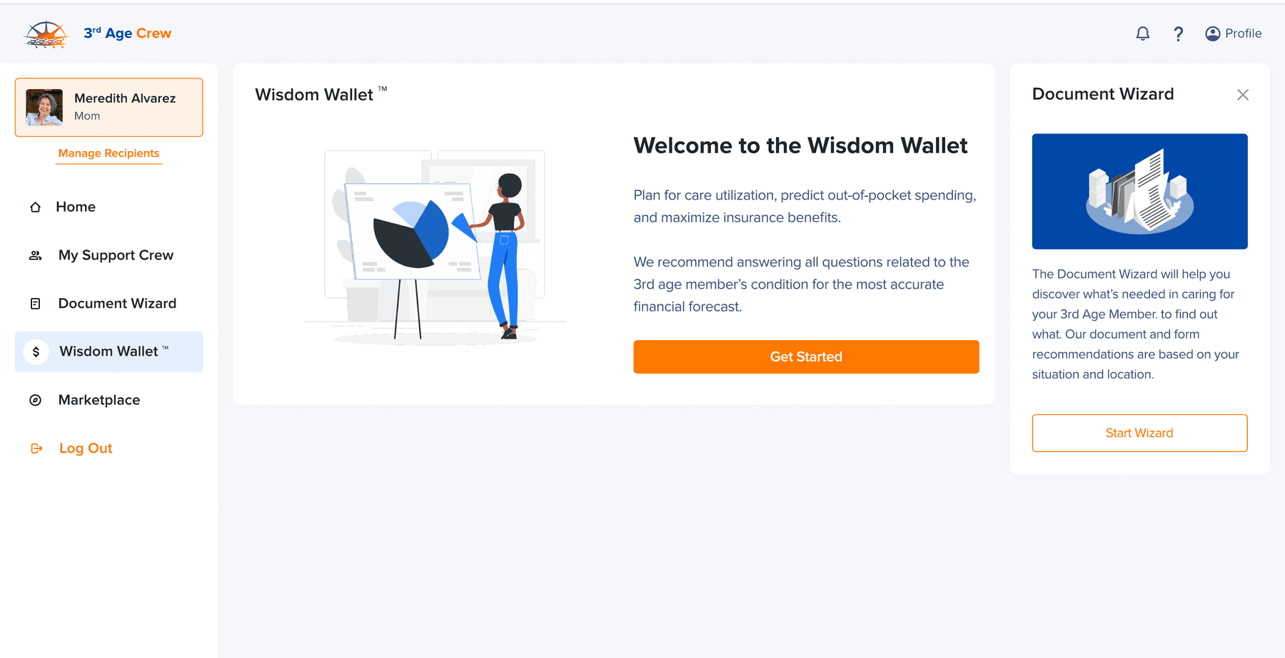
Named sub-products - Document Wizard, Wisdom Wallet, Support Crew, Break the Glass - turn features into things a family can remember.
Flow C
The marketplace
A real store, designed for buying on behalf of someone else.
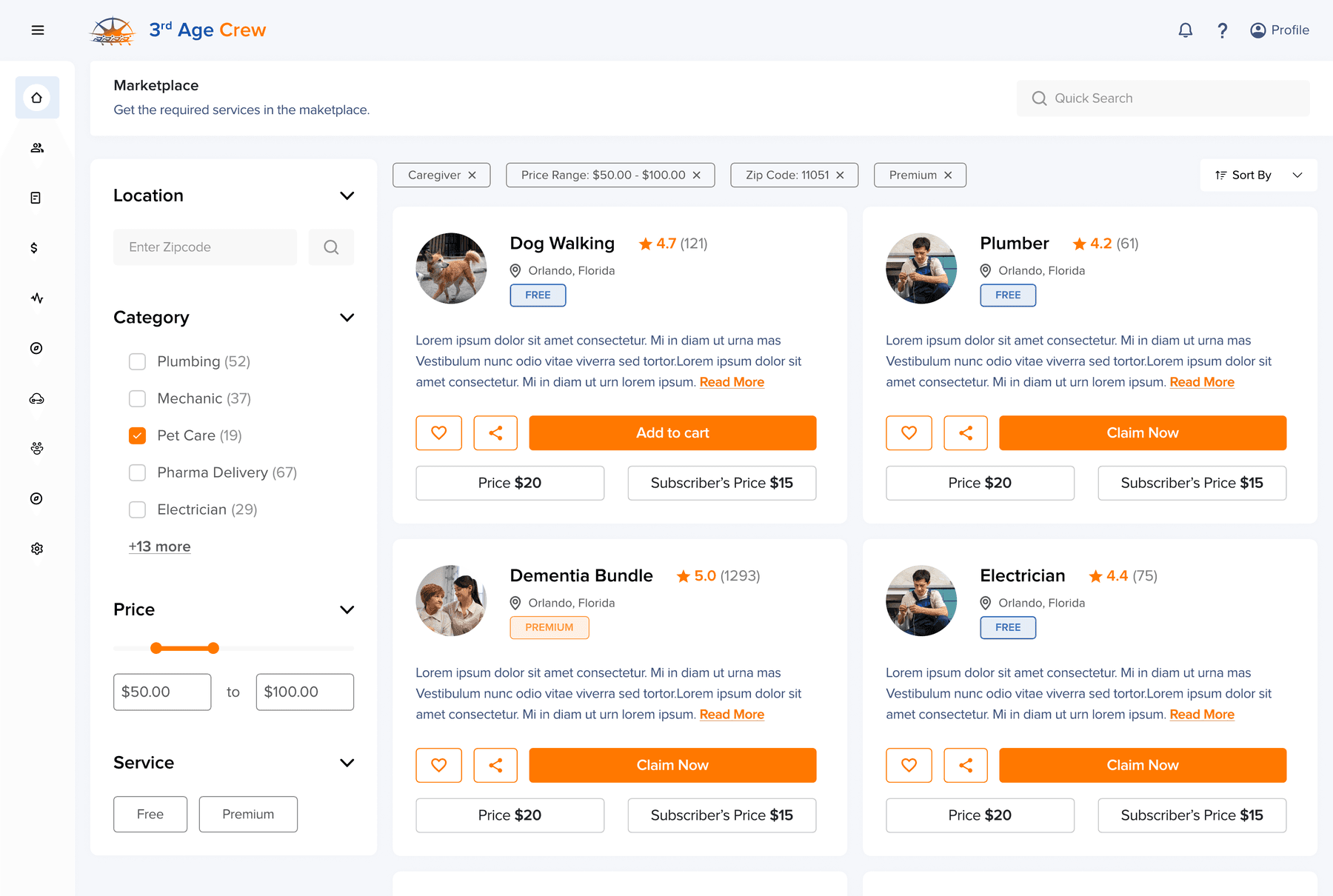
- 1Every card shows Price vs Subscriber's Price - the marketplace sells certainty to subscribers.
- 2FREE and PREMIUM badges separate member value from paid services.
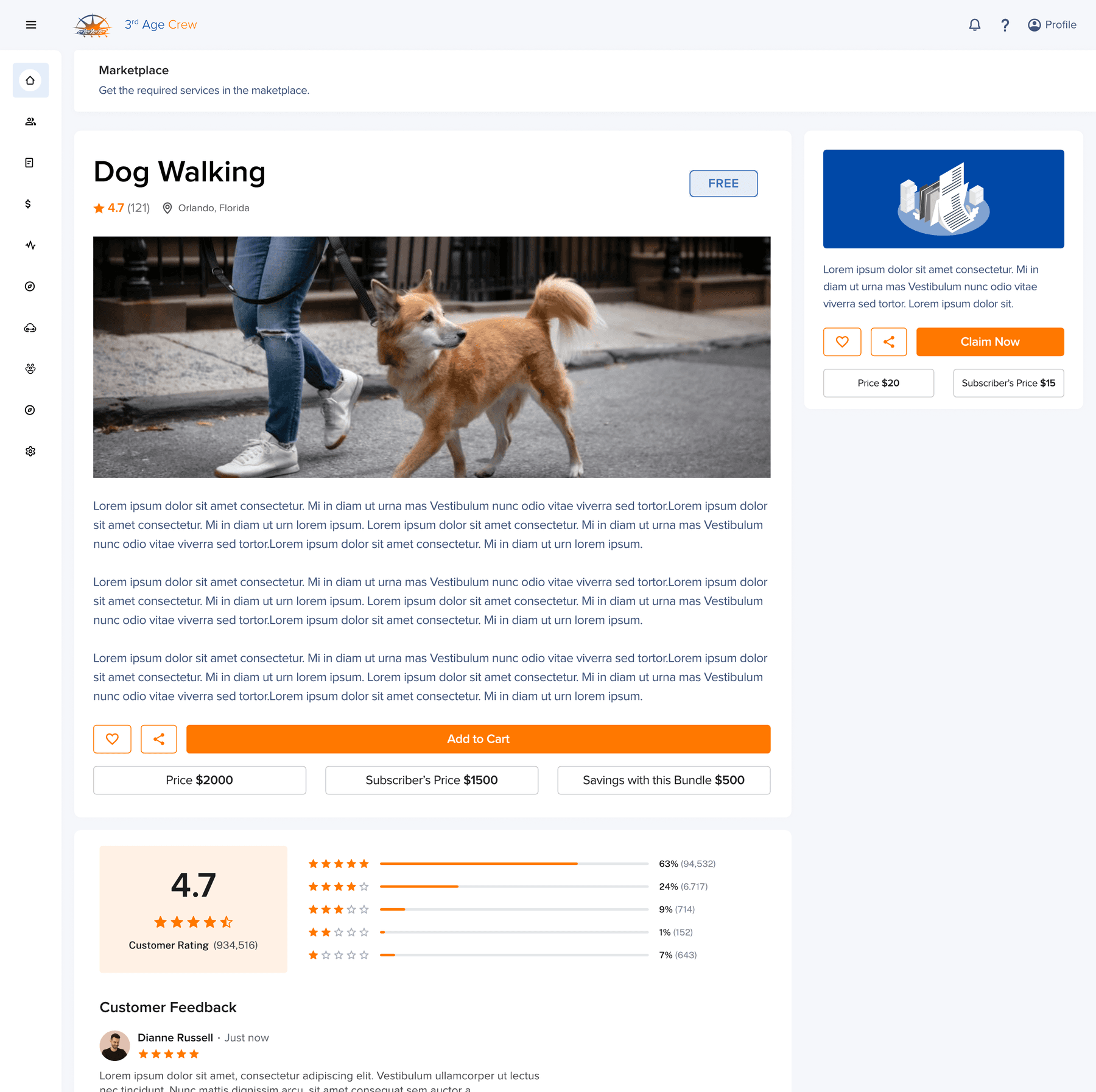
- 1Service pages carry the full trust stack - 4.7 rating with star histogram and review threads.
- 2Exact bundle savings, stated on the button row: “Savings with this Bundle $500”.
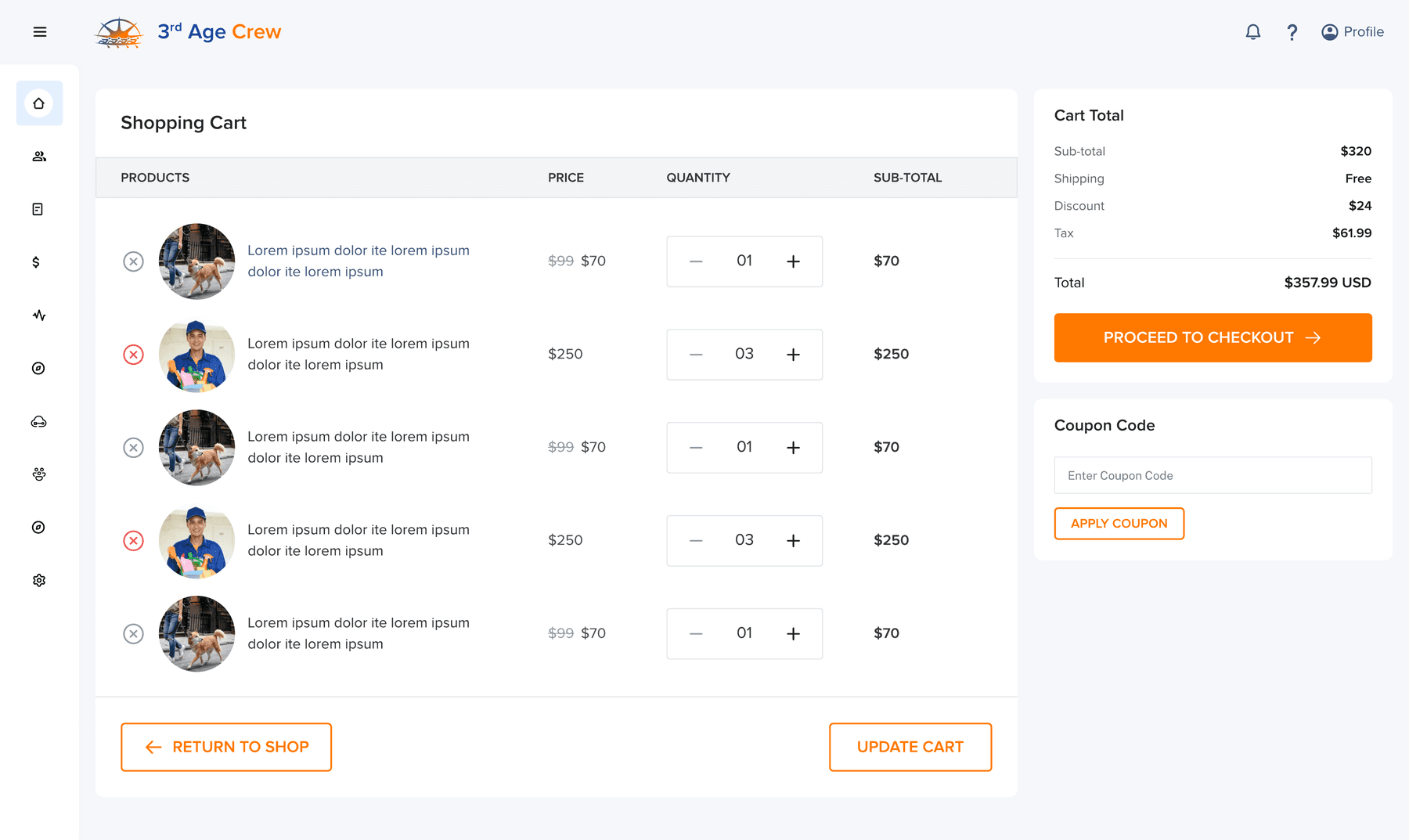
- 3Cart with quantity steppers and coupons; checkout then offers five payment options.
Flow D
Settings and support
These users will need humans - support is built in.
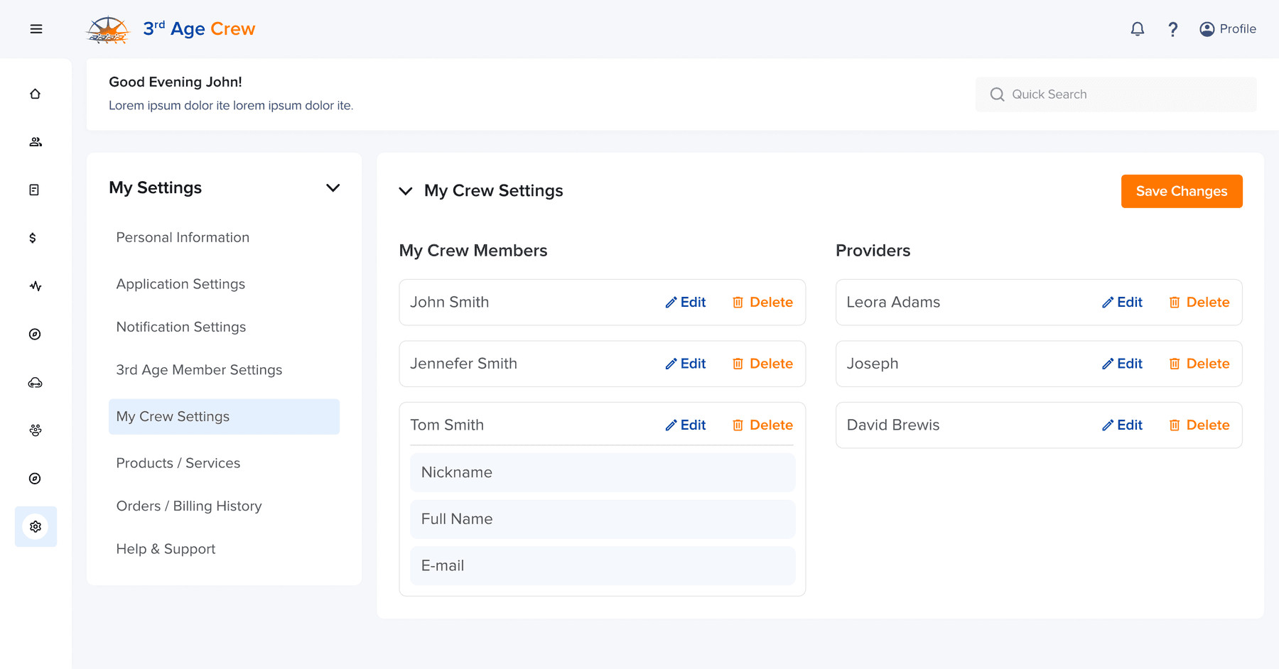
- 1Crew management treats family and providers as one address book.
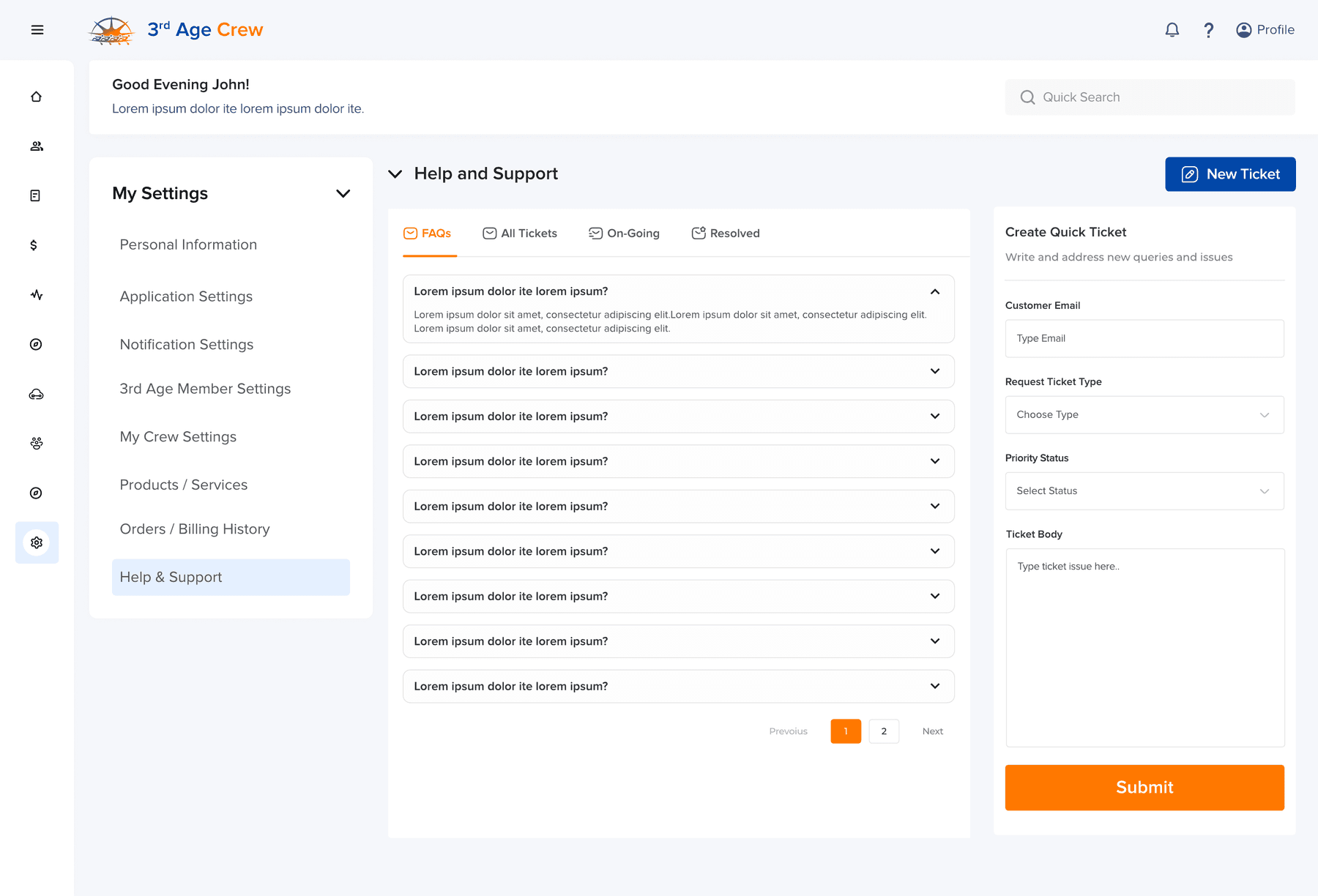
- 2FAQ accordion plus ticketing with priority and status tabs - All / On-Going / Resolved.
Designed as 3rd Age Crew; the product is now Navigage (navigage.ai). Logo and brand colors supplied by the client; design system and product UI by me.