AlertCloud · Product Design · Aug 2023 – Jun 2025
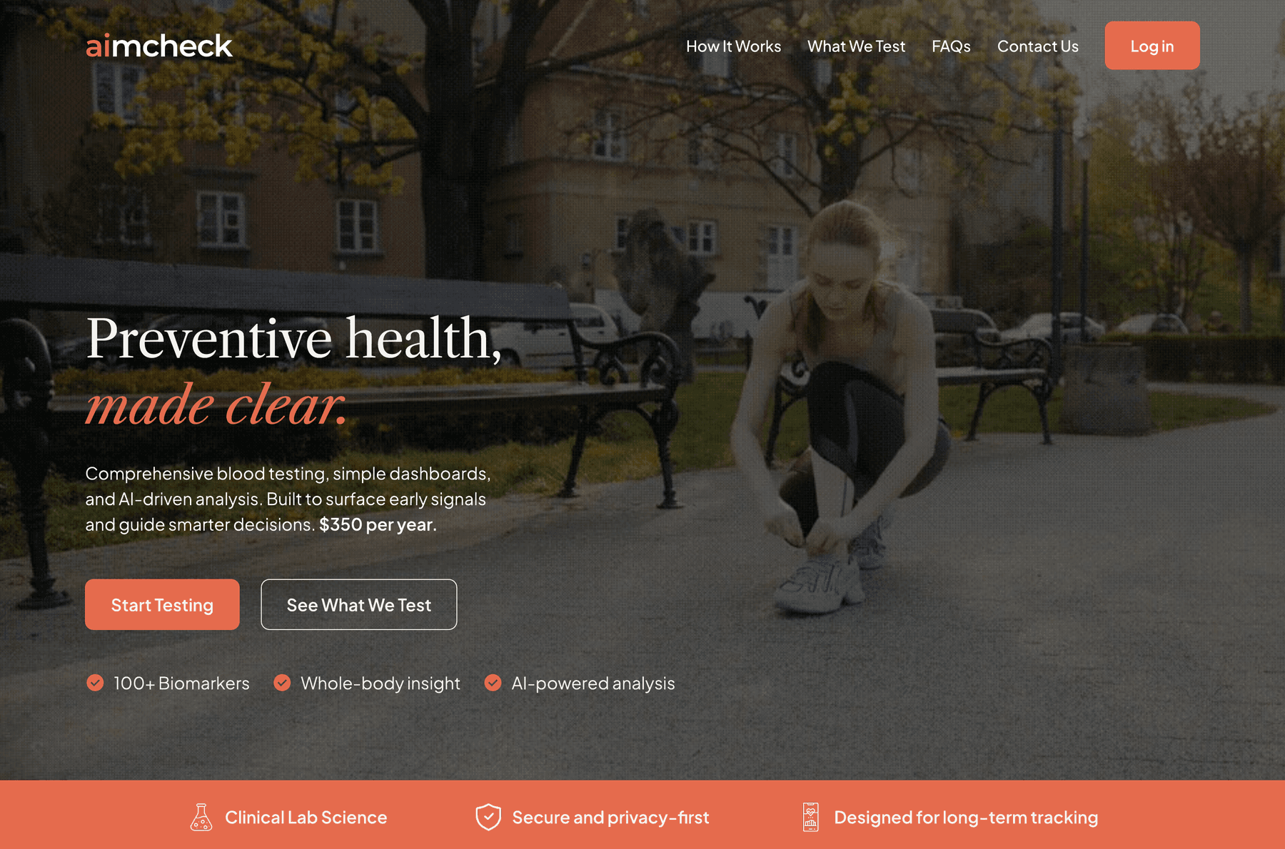
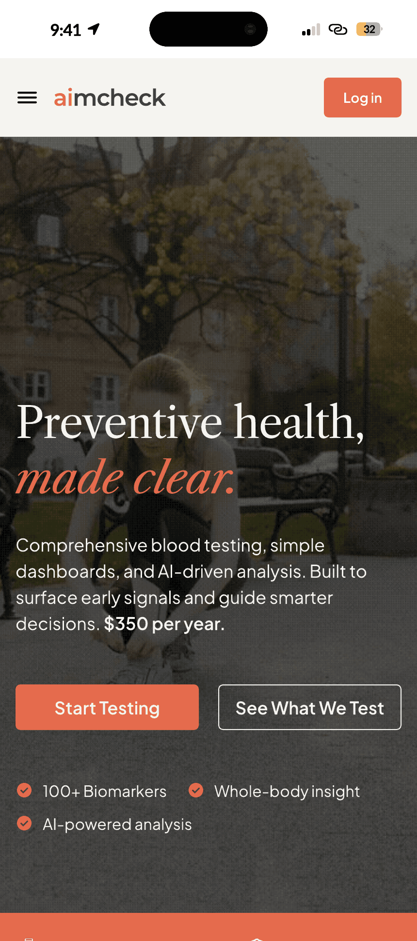
Preventive health,made clear.
D2C lab testing and health tracking platform built for modern consumers. One annual membership: a 100+ biomarker blood test at 2,000+ Quest Diagnostics locations, a personal Health Hub, and LairE, an AI assistant that explains what the numbers mean.
Role: Design Lead, AlertCloud (Aug 2023 - Jun 2025)Scope: full product UI, logo, design systemPlatform: web
01 / Context
One test, understood.
AimCheck is AlertCloud's direct-to-consumer preventive-health platform. One annual membership covers a 100+ biomarker blood test drawn at any of 2,000+ Quest Diagnostics locations, a personal Health Hub for results, and LairE, an AI assistant that explains what the numbers mean. I designed the entire surface: marketing site, purchase flow, onboarding, member dashboard, the design system, and the AimCheck logo.
The constraint that shaped everything: clinical data for non-medical people. The product asks consumers to pay $399 a year for lab results they cannot read. So the design problem was translation - HIPAA-grade seriousness and 100+ biomarkers, delivered with zero medical jargon, warm enough to trust, clear enough to act on.
100+
Biomarkers
2,000+
Draw sites
$399
Per year
HIPAA
Grade
Made clear.
The positioning line - “Preventive health, made clear.” - is also the design brief. Every screen answers one question: what does this mean for me? Biomarkers never appear as raw numbers with reference ranges. They are In Range, Moderate, or Out of Range. The AI is not a feature list item; it is LairE, a named assistant that connects patterns across biomarkers and says what to do next. The marketing copy, the dashboard, and the visual identity all carry the same promise.
02 / The identity
The AI is in the name.
The wordmark is one word, lowercase: aimcheck. The “ai” sits in the brand orange, “mcheck” in ink - the mark makes the technology visible without printing “AI-powered” anywhere. The same two letters carry through to LairE, the AI assistant, so product name and intelligence read as one system.


Two lockups, one rule - the orange ai never changes; the rest of the wordmark flips between ink and white so the mark works on paper-light and ink-dark surfaces.
03 / The design system
A system, not a style.
The identity and the interface run on one documented foundation - type, color, and components specified once and reused everywhere. Documented values come from the system's own Typography and Color sheets; spacing and component anatomy are reconstructed from the shipped screens and marked as such.
Core tokens / Typography
60px / Regular / 130% / -2%
48px / Regular / 130% / -2%
36px / Regular / 130% / -2%
32px / Regular / 130% / -2%
28px / Regular / 130% / -2%
24px / Regular / 130% / -2%
28px / SemiBold / Regular / 130% / 0%
24px / SemiBold / Regular / 130% / 0%
20px / SemiBold / Regular / 130% / 0%
16px / SemiBold / Regular / 130% / 0%
Core tokens / Color
brand / orange
#E56B4D
Action, warmth, the human body rather than the lab coat
surface / paper
#F5F4F0
Warm paper, never sterile white
ink / 100
#3C3D42
Text and dark surfaces
ink / 75
#3C3D42 · 75%
Secondary text
ink / 50
#3C3D42 · 50%
Labels and metadata
ink / 25
#3C3D42 · 25%
Dividers and disabled
status / green
#00B749
Status only: In Range
status / amber
#FFAB00
Status only: Moderate
status / red
#FF0721
Status only: Out of Range
One rule: green, amber, and red are reserved for health status and order states, never decoration.
Signature device
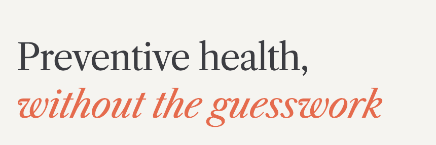
One device runs through the whole identity: a single italic serif word in orange inside key headlines. It marks the emotional beat of each sentence and turns the accent color into a reading cue.

Component anatomy
The primitives every screen is built from - rebuilt here natively from the tokens above.
Primary button
One forward action per screen
Secondary button
The quiet alternative
Status chips
Status before numbers, always
Annual Aimcheck Health Test
Included in your membership
ScheduleCard
One card, one job
Step dots
Reused from onboarding to lab booking
Component-level specs live in the Figma source; these are native rebuilds from the documented tokens.
Spacing and grid - reconstructed from screens
An 8-point rhythm across marketing and product; 12-column desktop grid collapsing to one column on mobile. Reconstructed from the shipped screens - the original spacing docs are not in the export set.
04 / The flows
From landing page to lab result.
Flow A
Marketing and membership
One promise, repeated until it is believed.

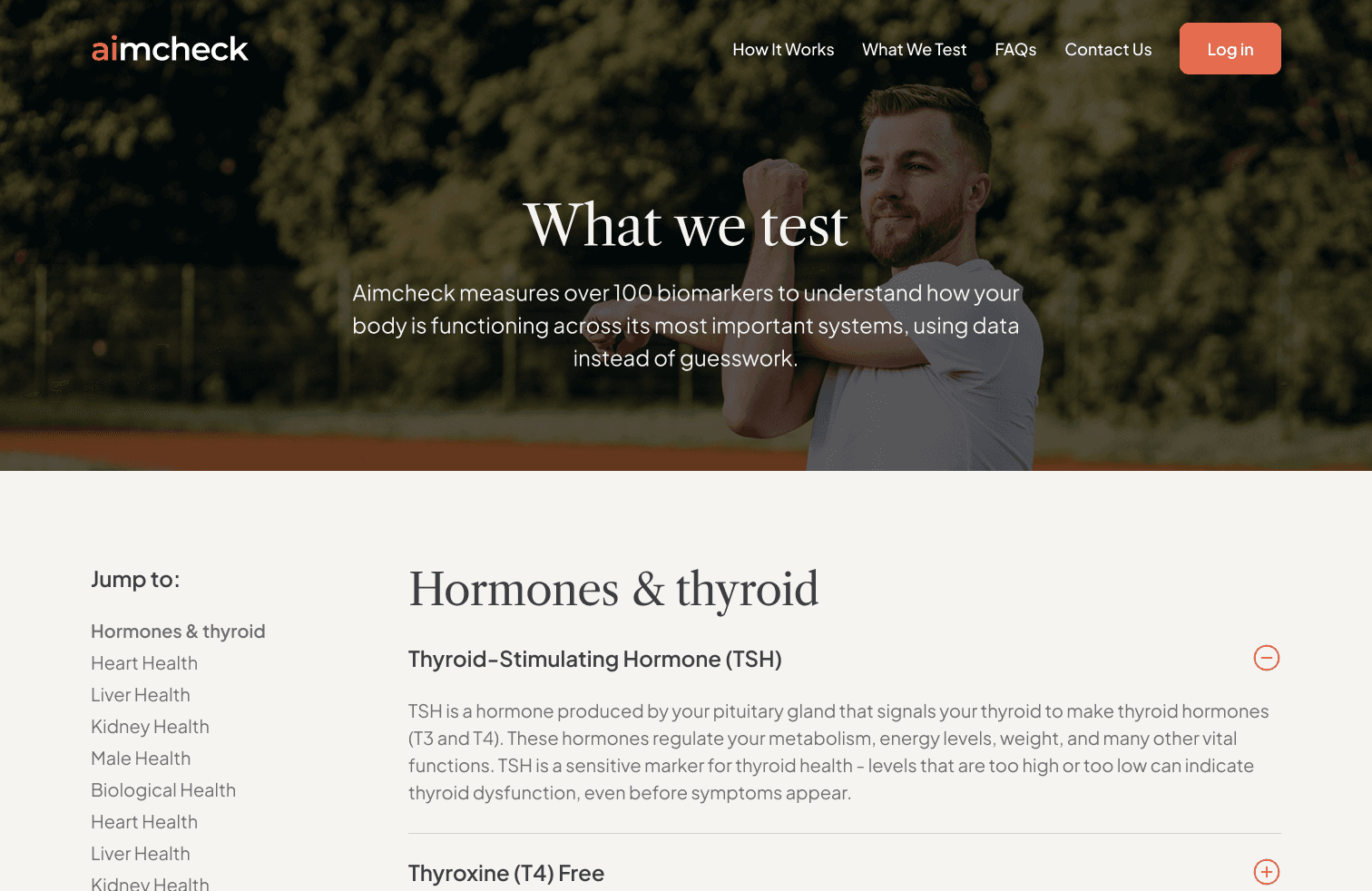
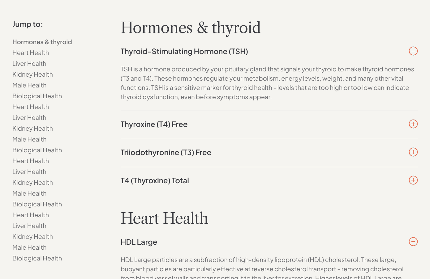
- 1“Jump to” rail keeps 100+ biomarkers navigable.
- 2Plain-language accordions - TSH and LDL Particle Number explained without jargon.
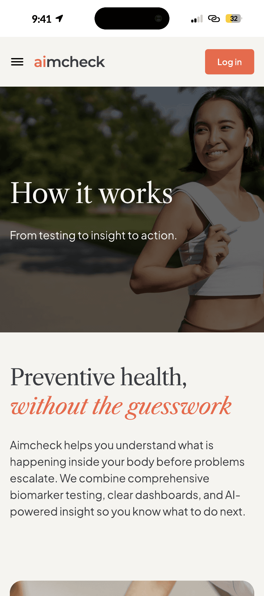
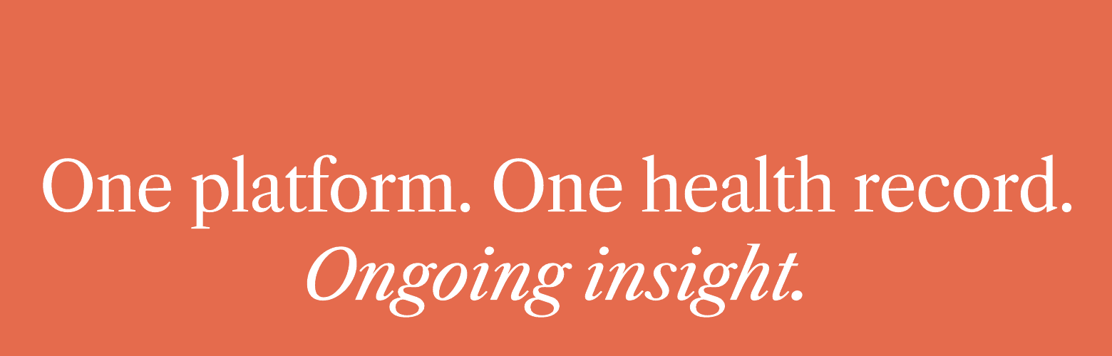
The system reflows, not shrinks - the editorial hierarchy, the italic orange accent, and the CTA rhythm survive the 430px column intact. Every marketing page ends on the same orange band - “One platform. One health record. Ongoing insight.” - so every path ends at the same decision.
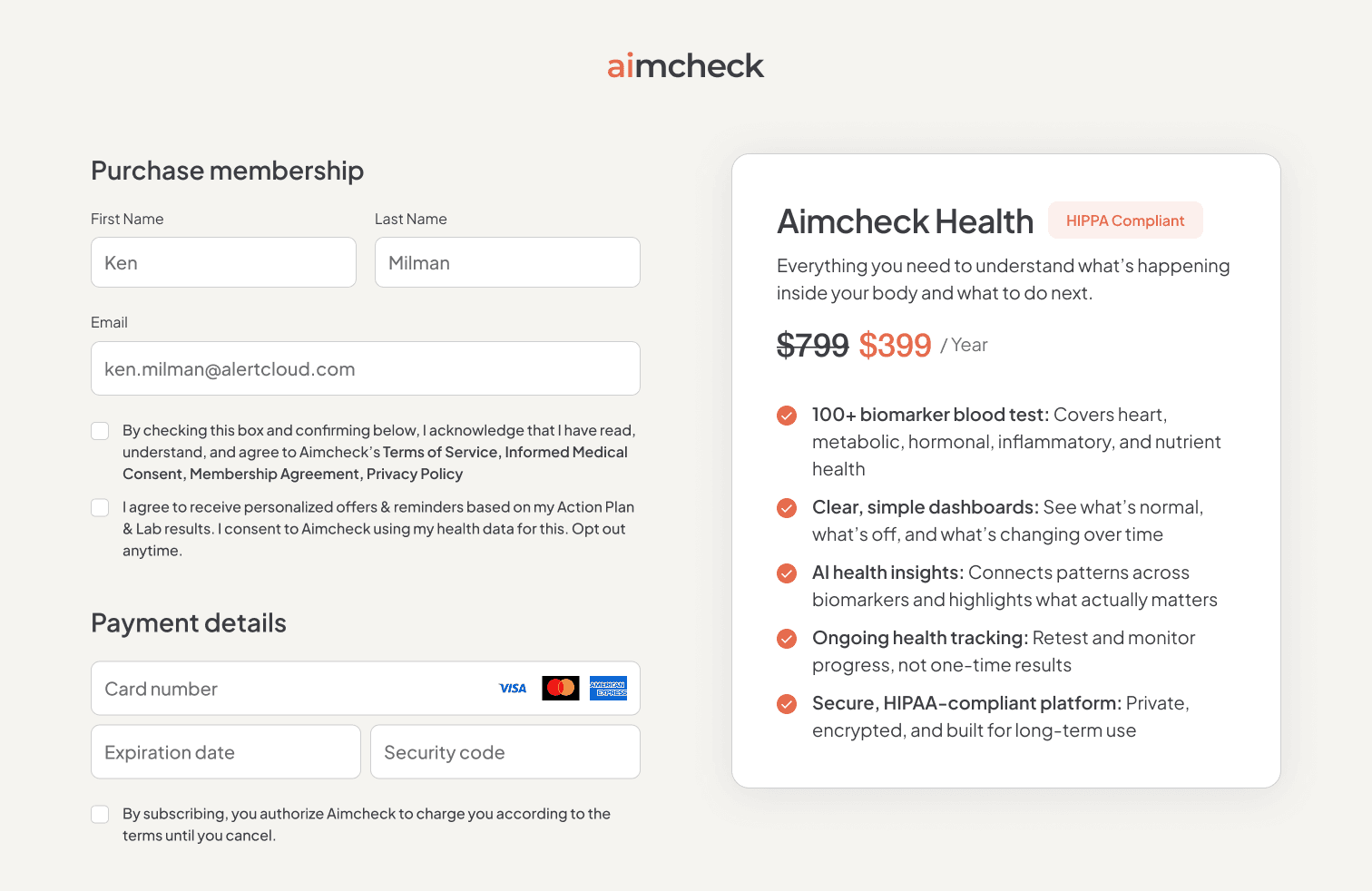
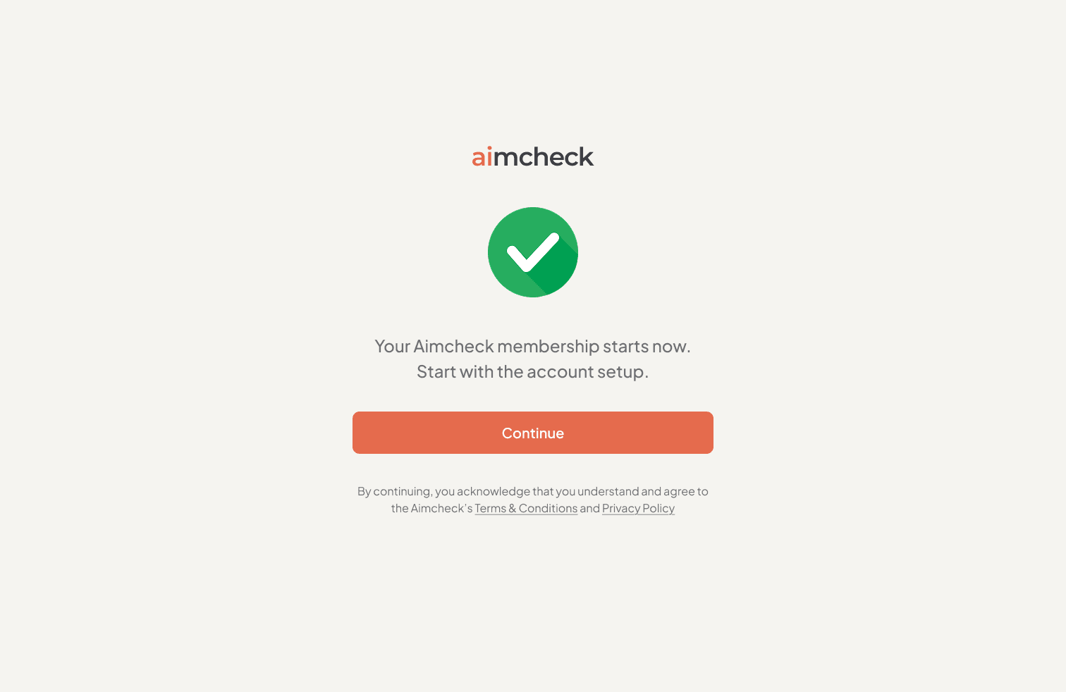
- 1The summary card sells certainty at the moment of payment - benefit checklist, HIPAA badge, $799 struck through to $399.
- 2Consent checkboxes designed into the form instead of a legal wall.
- 3Success reduced to one message and one action.
Flow B
Onboarding in three steps
Three steps, always visible.
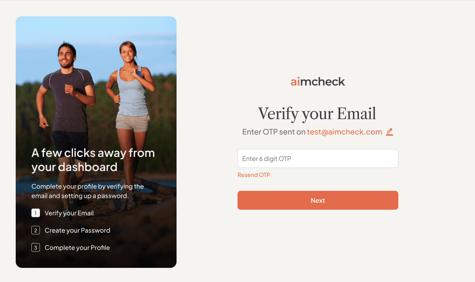
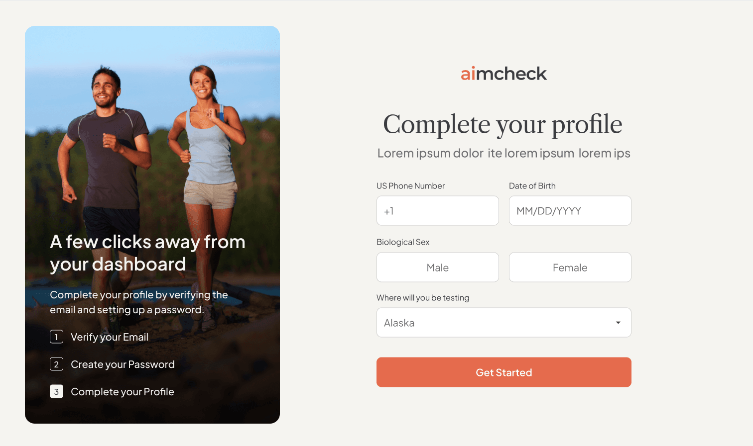
- 1A persistent left panel - “A few clicks away from your dashboard” - keeps the three steps visible through email, password, and profile.
- 2Only the fields a lab order legally needs: biological sex, date of birth, testing state.
Flow C
The Health Hub
The dashboard opens on the next action, not on data.
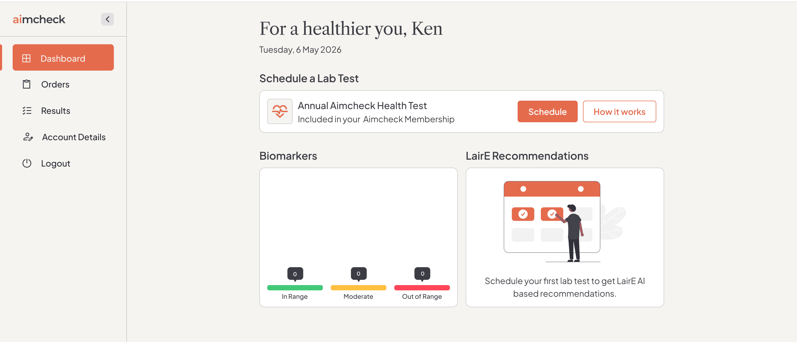

1The empty state leads with the next action.
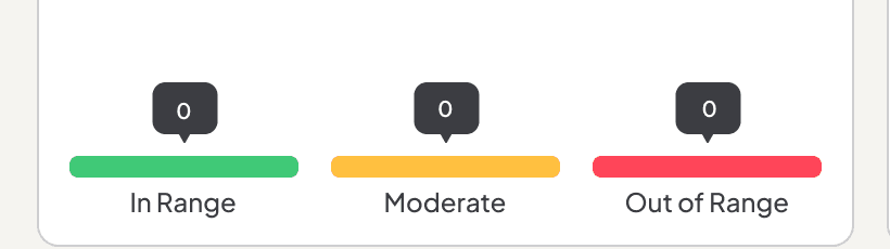
2Status is a tri-state - In Range / Moderate / Out of Range - before any number.
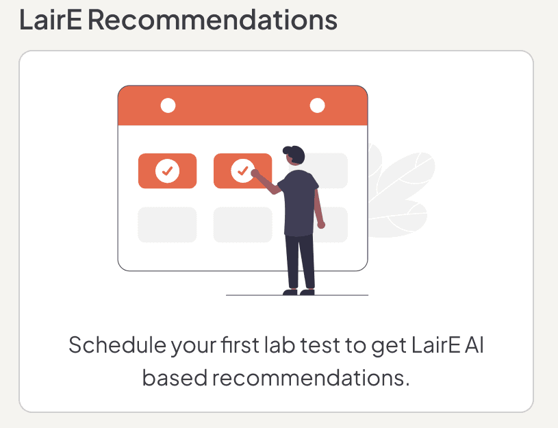
3Recommendations arrive after the first draw - the AI is introduced as a promise, not a button.
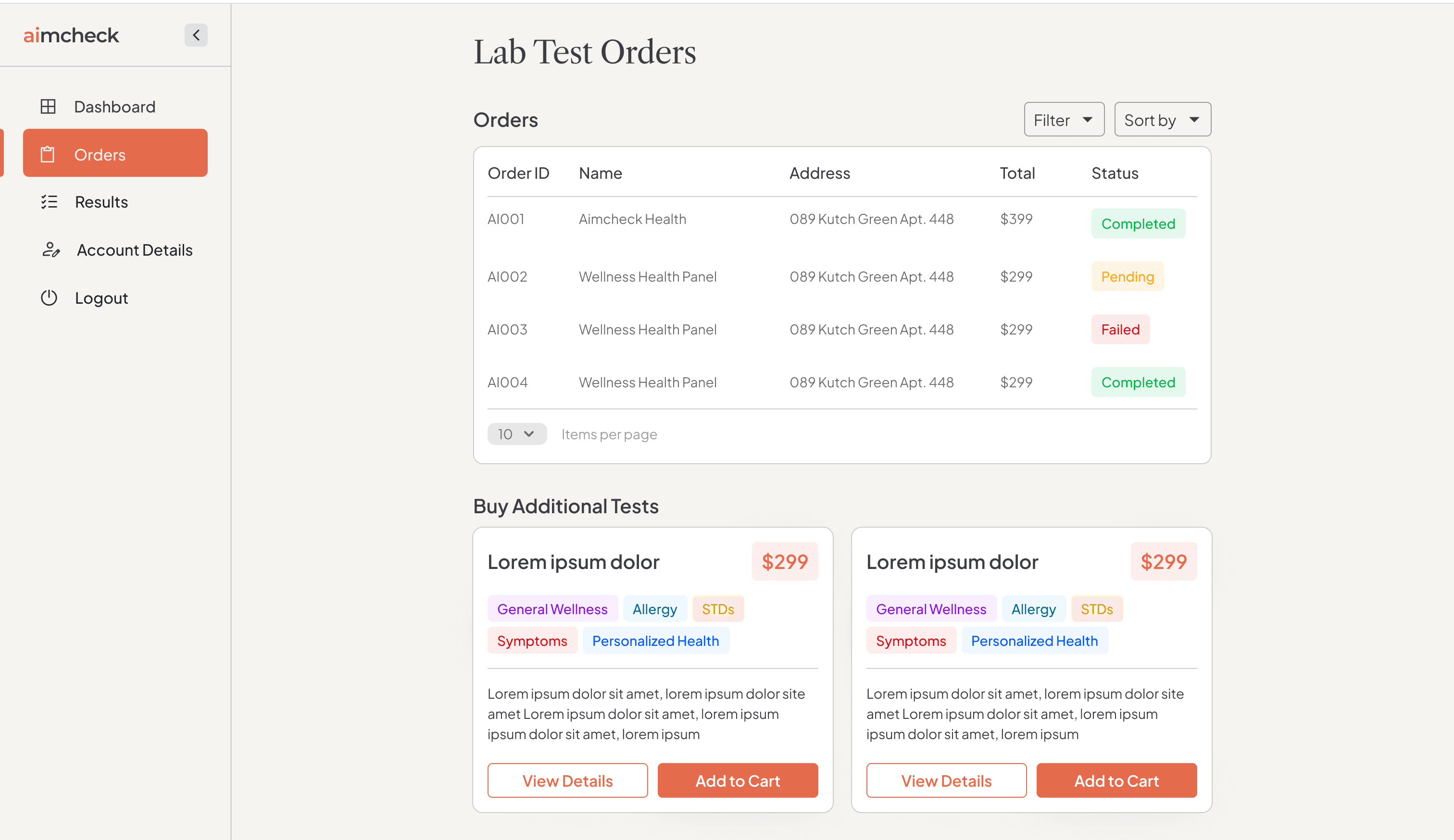
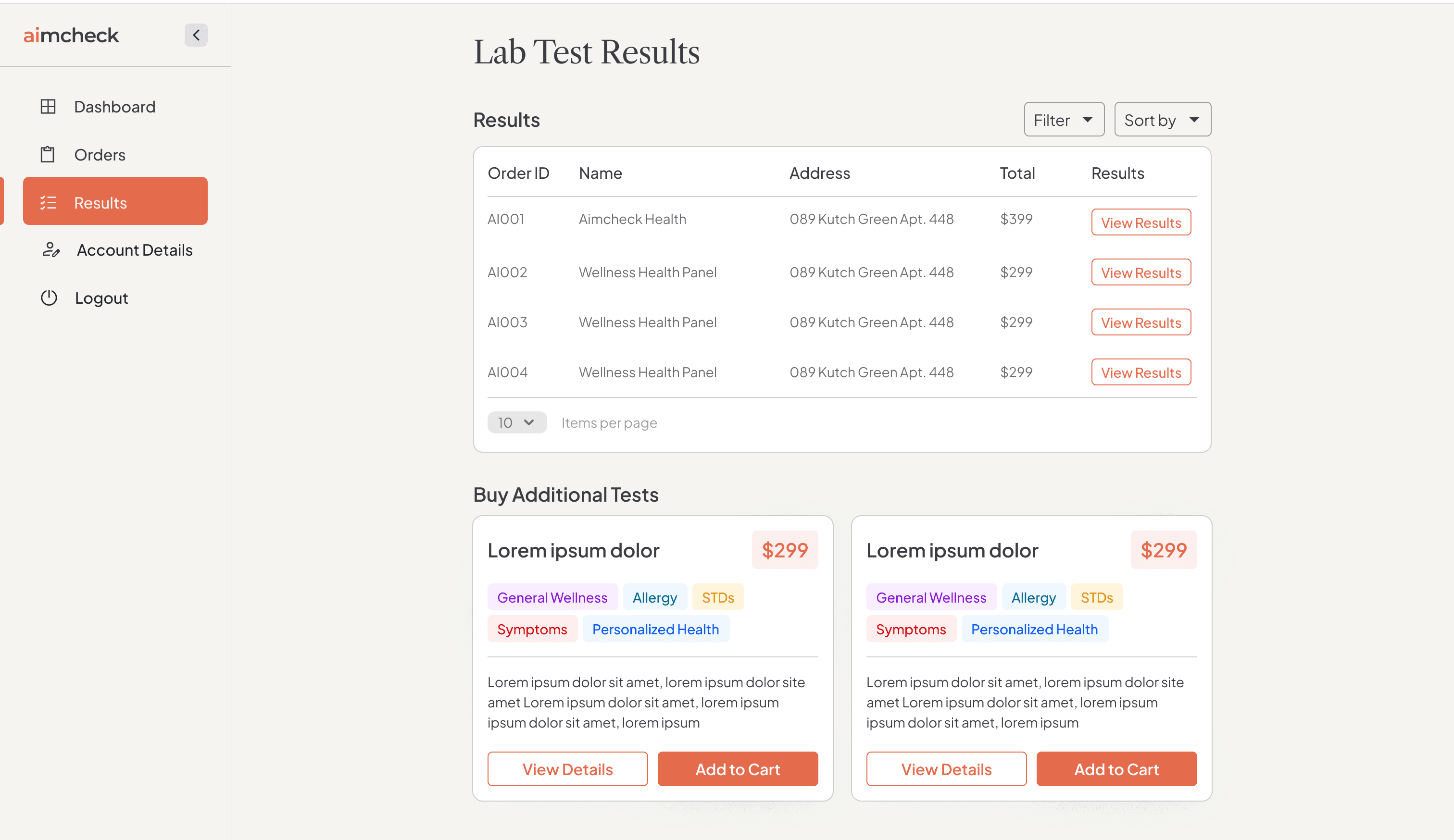
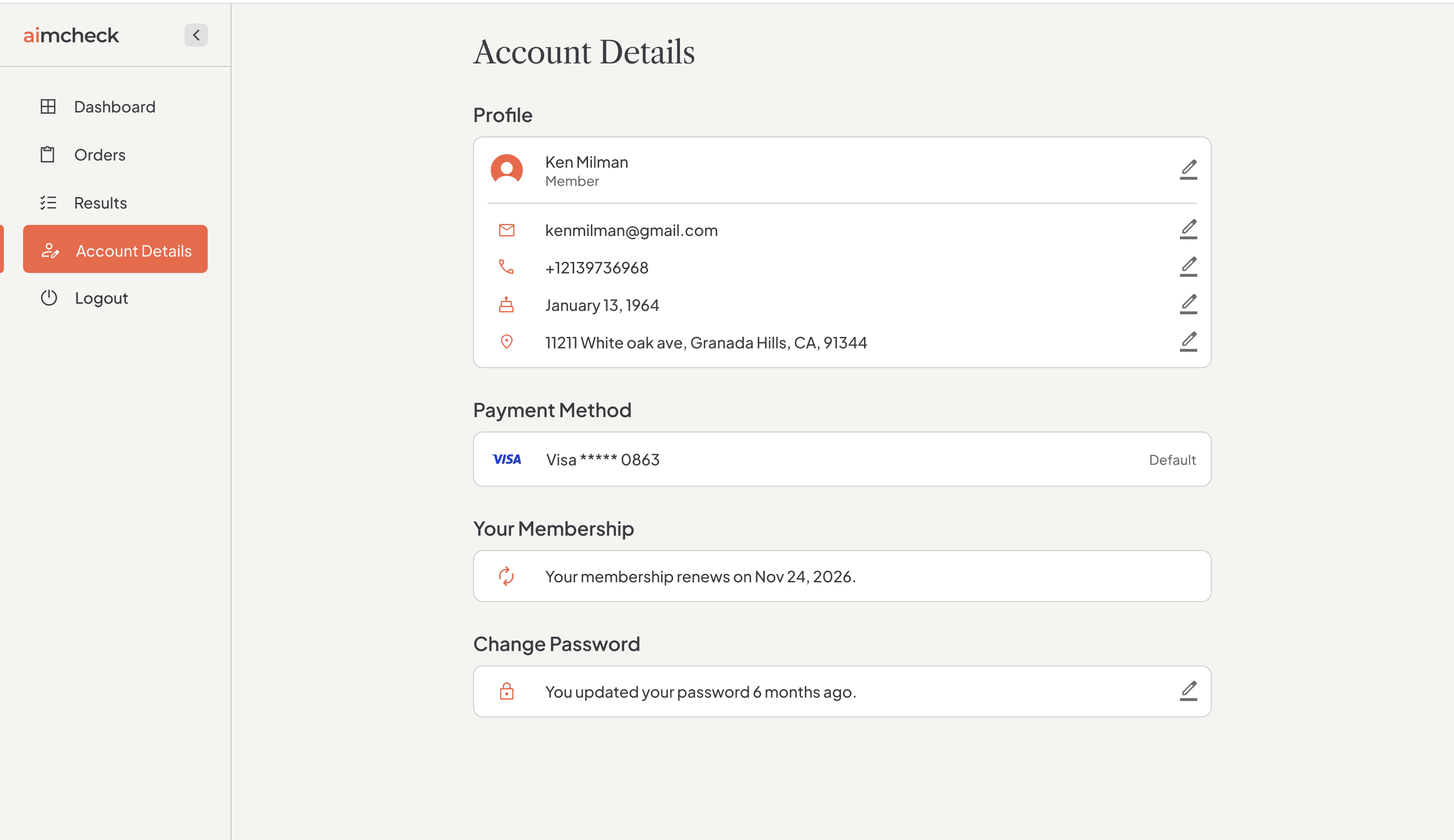
Orders, results, and account - one job per screen.
Flow D
Booking the draw
Guidance inside someone else's flow.
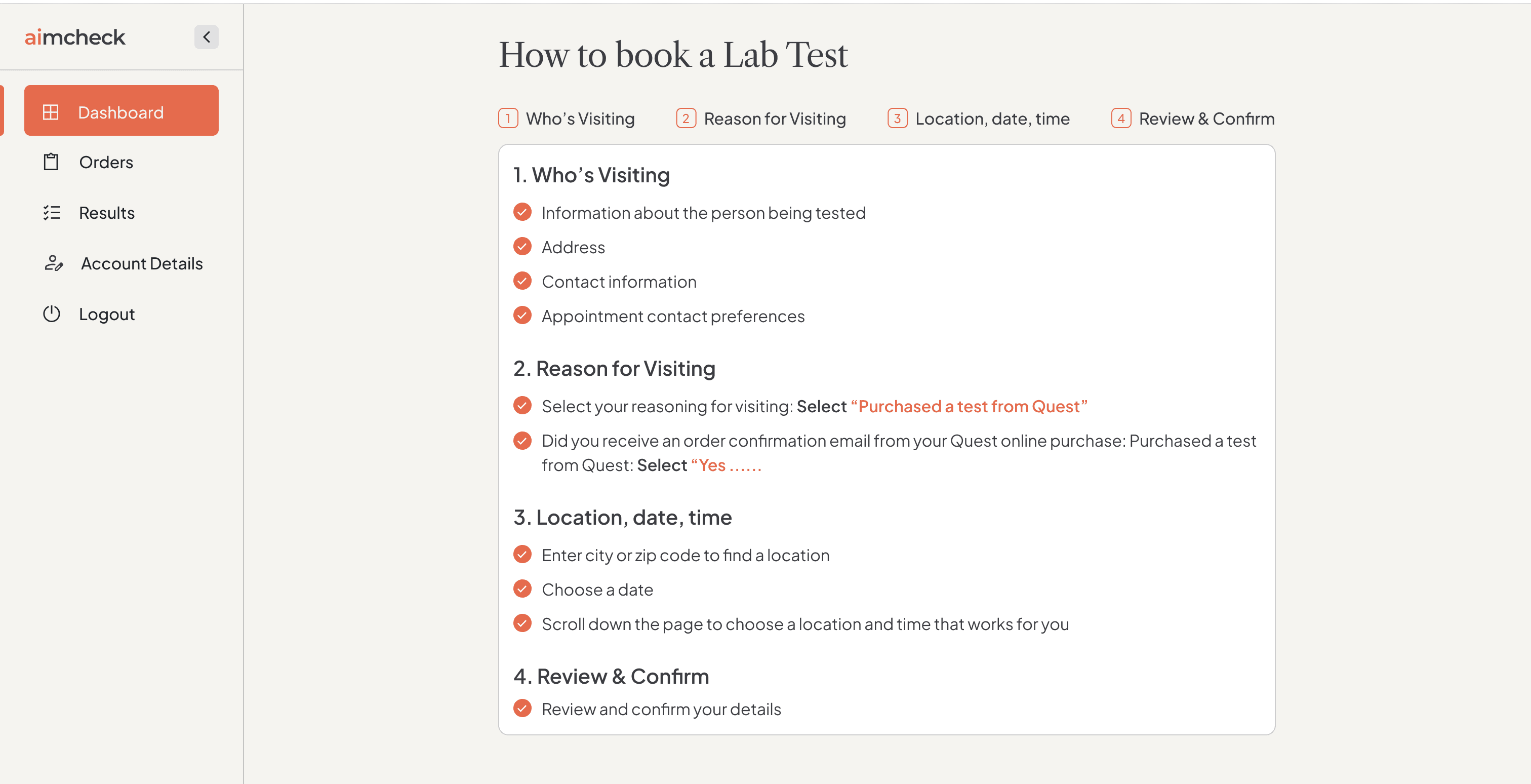
- 1The Quest Diagnostics handoff is a four-step stepper inside the product, not a link out.
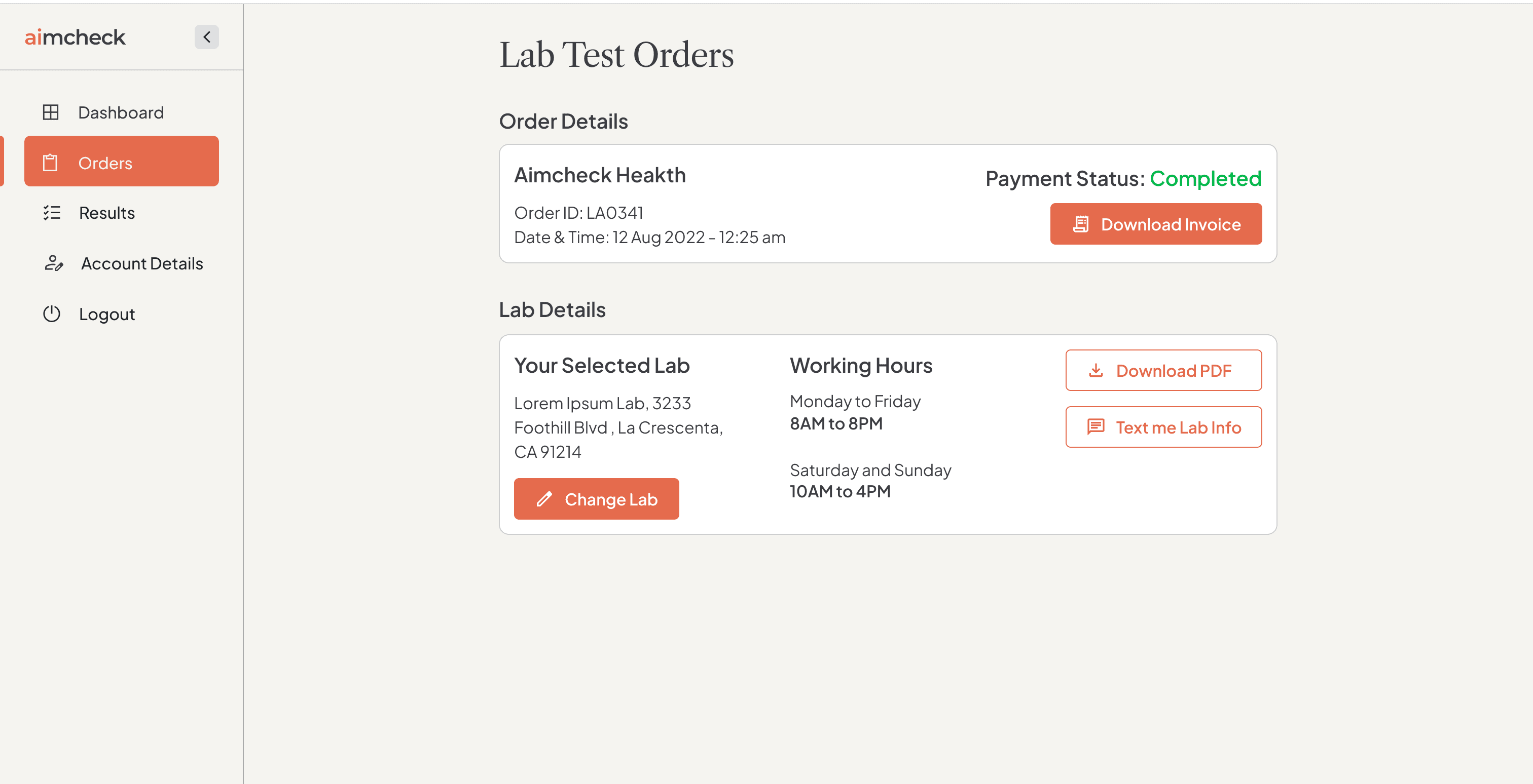
- 2Lab hours, change-lab, invoice, and “Text me Lab Info” stay one tap away on the order detail.
Designed end-to-end while Design Lead at AlertCloud. Live at aimcheck.com.